Wednesday, April 18, 2012

Pantry organization.

Probably the most popular organizing solution I do with ShelfGenie is a typical pantry.

Here is a very typical before picture for an average closet style pantry.


Usually when you have a pantry like this, there are only so many ways you can maximize the space.  Often times in a pantry like this, you will have short shelves that don't go the full depth of the pantry.  And even if you do have full depth shelving, most people typically only use about the first 8-12" of the space.  Things are stacked, crammed in and difficult to access.  Things tend to be put in where they happen to fit at the time.

If the shelves are too close together, you can't see what is behind, but if they are spaced too far apart then you end up with a lot of dead space.  Overall, it's difficult to maximize the space in your pantry, no matter how it is setup.

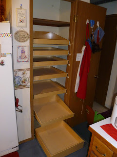
Now here is the same pantry after adding the glideouts.


There are a number of factors that go into designing the best way to reorganize your pantry with glideouts.  The first thing is always what sort of things you have in your pantry, or what things you might want to go into the space.

You can see with the finished design, starting at the bottom it is designed to accommodate taller and larger items on the bottom glideout.

The second glideout has sloped sides, so it is taller in the back.  This allows you to put taller bottles like oils, vinegar, 2 liter bottles, wine bottles, etc in the back, gives you added height so things don't fall out, but then leaves it short in the front for smaller items and also so you can see what is in there.

The next two glideouts are made for all of your mid-sized food items.  Boxes, crackers, pastas, larger jars, etc.
Then the next two are designed just for cans, and the last one is again a slope with the taller area designated for everyday taller items, like cereal boxes for instance.

By adding a couple of shelves that glide out and designating each shelf for a different kind of item, you utilize the space much more efficiently besides making everything so much more accessible.  You eliminate the dead space and you are also much much happier with the space every time you go in there, because it is no longer a frustrating space to use, but rather easy to access everything and a joy to use every time you go in there.

Friday, April 13, 2012

Lazy susan alternatives.

I had a lot of fun with this client.  Turns out we had a lot in common.  He is a brass player (him tuba, me trombone) and he is also quite the talented wine maker (I'm just a novice homebrewer at this point).

They had a good sized kitchen.  They weren't overloaded with things, but were having difficulty making things usable.

They had a typical corner cabinet with a lazy susan, which is helpful in a corner cabinet, but is not always the best use of the space.


With a typical lazy susan like this, you either have a fair amount of unused dead space, or you overload and over stack everything making it difficult to use, besides things continually falling off of the shallow sides, which is then impossible to get to.

Another thing that they had huge issues with was that all of their cabinets had half shelves in them.  Half shelves are common in newer construction.  The idea behind them is that with full shelves it makes access more difficult, you can't have taller items and appliances underneath and  you can see everything that is in there when you have a half shelf.


For those of you that have them though, typically all they do is annoy the owner because there is so much less shelving space to store things.

They also wanted to do something with the space under the sink


And they also had a very deep cupboard over the fridge that had a stile in the middle which made it virtually unusable for them.


So in their corner cabinet, we replaced their old lazy susans with what is probably my favorite ShelfGenie product, called the glidearound.


This combines both the ease of access of having a lazy susan and combining that with glideout shelves as well.  This helps you eliminate the dead space and overloading issues that you have my putting smaller things in the glideouts, and taller items on the sides.  The walls are also higher than a standard lazy susan, so you don't have to worry about things falling off the side.

They each rotate 360 independently of each other and each glideout comes out full extension.

Next, one of the great things about shelfgenie is we can build our glideouts on half shelves, but still have them come out full extension.

We also converted one of the cupboards to being just for trays, bakeware and cutting boards.


By putting everything up on end and in a glide, all of your tall pieces stay much more organized and much easier to access.

Also for under the sink here we added a riser on one side to help eliminate some of the dead space that you get under the sinks due to the drain pipes.

And lastly, and this was the most surprising for me, but the space we did for them over the fridge was the space that they were the most excited about.


One issue that people often have, if you will go back and look at the before picture here and one one of the other lower cabinets are the center stiles in cabinets.  We removed these and attached them to the doors.  These are not a load bearing piece but rather a cosmetic piece.  They help the cabinets look nice without having the doors touch and also help you not notice if the doors aren't exactly straight.  However they greatly effect ease of use in the space.

By removing the stiles and attaching them to the door, they still look normal when closed, but give a much better ease of use with your cabinets.

They were so happy that they were able to use that huge cabinet space over the fridge as well as get their Kitchenaid mixer off of their counter.

All in all another happy client!

Thursday, April 5, 2012

Corner cabinets and cookbooks.

This was a relatively simple design, but produced great results for this kitchen.

One of the things I do when dealing with kitchen organization is spend a good deal of time going over what you have in your kitchen and some lengthy discussions about why you use the kitchen the way you do and what might be a better way.

To start with, her kitchen went in a semi-circle, with the windows mirroring the cabinets.  It's a nice look and gives some interesting depth to the kitchen design, but produces some cabinets that are a little deeper than normal and makes accessibility more difficult.


This client also had many cookbooks which were taking up a good deal of space as well as being difficult to access.  Also because of all of the cookbooks, she was only able to use about half of the space as the cookbooks made the back of the cabinet inaccessible.


Adding glideouts to the corner cabinets instantly made the whole area much more accessible and easy to use as you can see here.


And one of my favorite things that we can do with cookbooks is add a side slope to the glideout.


Adding the slope to the side does a couple of things with cookbooks.  First of all, because of the 7.5 inch height in the back, you are able to have the books in their securely.  But having it short in front allows you to be able to easily see the spines of the book as well.  And by turning the slope sideways, you use the full depth of the cabinet.  And this client will still have space available in the front for other items as well.